MINIMAA: Minimalist Launcher
- 4.5
- Rating
- 10.00K
- Installs
- $0.99
- Price

 Analysis by App-foxy
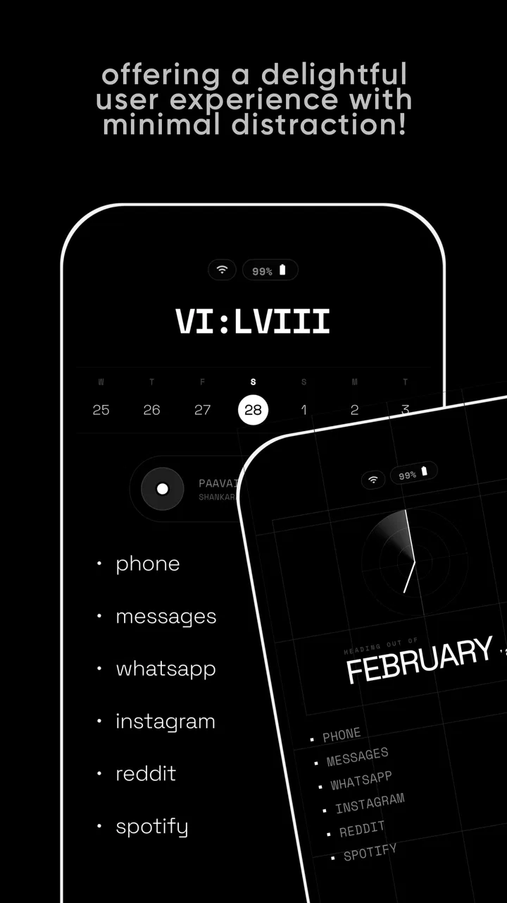
When a phone is shared around a home, the problem is rarely just “too many apps.” It is usually the small decisions that pile up: opening a social feed while looking for a message, handing the device to someone else without a clear starting point, or losing track of which shortcuts belong to whom. I tested MINIMAA: Minimalist Launcher with that kind of everyday use in mind, and I found its strongest idea is also its most demanding one: the home screen should stop competing for attention.
This is a personalization app from Bract Studio, built around a stripped-back launcher rather than a collection of visual themes or animated widgets. It costs $0.99, carries an Everyone age rating, and currently sits at a 4.5 average from around 1.1 thousand ratings. Those details give a useful picture of the audience: MINIMAA is approachable enough for ordinary household use, but its appeal depends on whether you genuinely want a quieter phone rather than simply a different-looking one.
How MINIMAA feels on a shared household phone
The first thing I noticed was how quickly a minimal launcher changes the rhythm of passing a phone to another person. A conventional Android home screen often reflects one individual’s habits: several pages of icons, news widgets, shopping shortcuts, games, and folders whose logic makes sense only to the owner. On a shared device, that arrangement creates friction. Someone asking to make a call or check a calendar may have to search through a layout they did not create.
You May Also Like

 Blood Strike: 2.5 Anniversary
Blood Strike’s Loadouts Turn Every Drop Into a Tactical Gamble
A close look at Blood Strike’s custom loadouts: how fast access to signature weapons reshapes its battle royale rhythm, rewards preparation, and narrows the gap between fights.

 Pandora - Music & Podcasts
Pandora’s Music Is Easy to Start, but Harder to Recover
Pandora’s strength is its low-effort path from a seed to a station. Its weak spot is how much confidence it asks you to place in connection, setup, and quiet recovery.

 8 Ball Pool
 Is Built on Rivalries, Rematches, and Routine
A close look at the rivalries, rematches, shared routines, and unanswered safety questions that turn a quick pool match into a persistent mobile community.

 Samsung Music
’s Quiet Strength Is Playing What You Already Own
Its reach comes less from spectacle than from dependable access to a personal library. That simplicity is both the app’s strongest retention engine and its ceiling.

 AccuWeather: Weather Radar
AccuWeather Review: A Quick, Clear Forecast for Everyday Decisions
For everyday plans, the best forecast is the one you can understand quickly. AccuWeather makes rain timing, radar, and local conditions easy to act on, with a few trade-offs.

 Hill Climb Racing
Why Hill Climb Racing Still Turns Crashes Into One More Run
A tiny car, a bumpy hill and one more upgrade: Hill Climb Racing keeps resurfacing because its simple chaos makes every near-miss feel personal.
More From Our News Desk
View All News


MINIMAA works better when the goal is a neutral landing page. Its clean presentation reduces the visual noise that normally encourages browsing before the intended task begins. That makes it suitable for a household tablet or spare phone used for practical jobs, provided everyone agrees on what the device is for. It is not a family-management system, and I would not treat it as one. It changes the entry point to the device; it does not replace separate accounts, privacy settings, or clear house rules.
A realistic example is a phone kept in a kitchen or hallway. One person uses it for timers, calls, directions, and a shared shopping list. Another checks appointments, while a child may occasionally use it for an approved learning app. With a normal launcher, every user sees the owner’s personal clutter. With MINIMAA, the home screen can feel more like a common control panel. That does not solve account boundaries, but it makes the device’s purpose easier to understand at a glance.
The important trade-off is that a shared screen can become too neutral. If the phone is actually personal, removing familiar visual cues may make it slower for the owner to reach less frequently used tools. I would choose this launcher for a deliberately focused device, a secondary phone, or someone who wants their main phone to feel less addictive. I would be more cautious if several people need rapid access to very different app collections.
What the setup changes—and what it cannot change
Installing a minimalist launcher is not the same as creating a restricted profile. The launcher can simplify what appears first, but it should not be mistaken for a barrier that prevents someone from opening every installed application. That distinction matters in a household. If a device contains personal email, banking, private photos, or work accounts, the right solution is still a separate user profile, device lock, or account arrangement supported by the operating system.
I found it useful to decide on the device’s role before arranging the home screen. For a personal digital-detox phone, I would keep only the tools needed for communication, navigation, work, and emergencies within easy reach. For a shared household device, I would first agree on a short list of common tasks. That small planning step prevents the launcher from becoming a plain-looking version of the same overloaded screen it was meant to replace.
The app supports Android 7.0 and later, which gives it a broad compatibility range for older household phones that are still useful as shared devices. The current version is 1.2.11. On an older phone, a simpler launcher may feel especially welcome because there is less visual activity competing with the device’s basic functions. Still, the age of the phone itself can affect responsiveness, battery life, and app compatibility; a minimalist home screen cannot repair hardware limitations.
One practical setup tip is to separate “easy to reach” from “available at all.” A shared phone may need many installed apps, but only a few deserve a prominent place. Keeping every service visible defeats the purpose. I would put communication and safety-related tools where everyone can find them, then leave occasional utilities accessible through the launcher’s less prominent navigation rather than displaying them as constant invitations.
Another useful boundary is to avoid configuring the screen around one person’s temporary routine. If the device belongs to the household, a shortcut that matters only during one week can make the layout confusing for everyone else. MINIMAA’s minimalist approach works best when the visible choices remain stable. The fewer changes people have to remember, the more the phone feels like a shared tool rather than a personal workspace being borrowed.
Coordinating access without pretending the launcher is a family-control tool
Household coordination is where expectations need to stay realistic. MINIMAA can make the first screen calmer and more legible, but it does not create a schedule for who may use the phone, separate one person’s history from another’s, or establish permission levels. I would pair it with simple verbal agreements: which accounts may stay signed in, which apps are for adults, and what should happen before the device is handed over.
That may sound basic, but a cleaner interface makes those agreements easier to follow. When a device presents fewer distractions, people are less likely to confuse “the phone is available” with “everything on the phone is available to everyone.” The visual simplicity becomes a prompt to think about boundaries rather than a substitute for them.
For a shared calendar or shopping workflow, I would use MINIMAA as the front door and keep the coordination inside the relevant services. The launcher can help everyone reach the same tools without scanning a crowded page. It cannot decide whether an appointment belongs to one person or the whole household, so naming conventions and account choices still matter more than the home-screen design.
There is also a subtle benefit for handoffs. When a phone is passed between people, a conventional launcher exposes the owner’s arrangement and can invite accidental taps. A sparse screen lowers that risk simply by presenting fewer obvious targets. I would still lock private apps and avoid leaving sensitive conversations open, but the reduced clutter makes the physical act of handing over the device less awkward.
The limitation is that minimalism can hide useful context. A widget-heavy launcher may show weather, upcoming appointments, package updates, or reminders without opening anything. MINIMAA’s cleaner approach asks users to enter an app instead. For someone coordinating a busy household from the home screen, that extra step may be a genuine disadvantage. The right choice depends on whether glanceable information or reduced temptation is the higher priority.
Age, trust, and the meaning of an Everyone rating
MINIMAA is marked Everyone, so its presentation is suitable for a broad audience. I would be comfortable introducing the interface to an older relative who finds crowded Android screens tiring, or to a younger user who benefits from a less distracting starting point. The simple layout can make the phone feel less intimidating because there are fewer visual decisions competing for attention.
However, an age rating should not be confused with supervision. A child using a phone with MINIMAA may still reach apps, websites, messages, or accounts that the launcher does not govern. Parents and guardians should handle those concerns through the phone’s account and safety settings, not by assuming that a sparse home screen equals a child-safe environment.
For older family members, the trade-off works in the other direction. Removing clutter can improve confidence, but hiding familiar icons may initially feel disorienting. I would set it up together, ask which tasks matter most, and keep the visible arrangement consistent afterward. The best result is not the most extreme minimalist screen; it is one that the person can understand without needing to ask where basic functions went.
Trust matters for shared devices too. If everyone knows that the launcher is only an organizational layer, it is easier to establish honest expectations. I would not use MINIMAA to create a false sense of privacy between household members. A person should know whether the device has separate accounts, whether notifications are visible, and who can unlock it. The app can support a respectful arrangement, but it cannot define one on its own.
Where it stands beside ordinary launchers
The usual Android launcher is more flexible. It generally favors widgets, folders, multiple pages, visual customization, and fast access to a large app library. That is the better option for someone who wants the home screen to function as a dashboard or who regularly switches between many tools. A conventional launcher also makes it easier to personalize the phone around one person’s work and entertainment habits.
MINIMAA makes a different choice. Instead of helping me display more, it encourages me to expose less. That can be more effective than relying on willpower alone because the first screen stops advertising every possible distraction. I found this especially useful when I picked up the phone for one small task and wanted to avoid sliding into unrelated browsing.
It also compares differently with full digital-wellbeing tools. Screen-time dashboards, app timers, and focus modes provide measurements or restrictions, while a minimalist launcher changes the environment in which the decision begins. I would not choose one as a replacement for the other. Someone who needs hard limits should use the operating system’s controls as well. Someone who mainly wants fewer visual prompts may find MINIMAA more comfortable than a screen full of warnings and usage reports.
There is a cost to that quietness. If I need to jump between many apps throughout the day, a standard launcher may save time. If I depend on widgets for live information, MINIMAA may feel sparse rather than liberating. Its strength appears when reducing choice is the goal; its weakness appears when the home screen needs to be a rich information surface.
Small habits that make the minimalist approach work
The most effective workflow I found was to treat the home screen as a decision filter. Before placing an app where it is immediately visible, I asked whether it supports a recurring responsibility or merely benefits from being easy to open. That question is more valuable than endlessly rearranging icons. A minimalist launcher succeeds through the choices made around it, not through appearance alone.
For a shared device, I would create a short “common tasks” plan before anyone starts using it. Calls, messages, navigation, household lists, appointments, and emergency information may deserve priority. Entertainment can remain installed without becoming part of the device’s visual identity. This arrangement helps both adults and children understand what the phone is mainly for, while avoiding the claim that the app itself enforces those priorities.
A second tip is to review the layout after real use rather than trying to perfect it immediately. If someone repeatedly searches for the same tool, that tool may need a more visible position. If a shortcut is constantly opened by mistake, it may be too prominent. The point is not to make the screen austere for its own sake; it is to make the first choice intentional and predictable.
I would also explain the arrangement to every regular user. On a personal phone, the owner can adapt privately. On a household phone, unexplained minimalism may look like missing functionality. A brief walkthrough prevents frustration and gives people a chance to identify a genuinely necessary app before the layout becomes fixed in everyone’s mind.
Finally, I would keep account separation outside the launcher’s job description. Use distinct profiles or locks where privacy matters, sign out of personal services when appropriate, and be careful with notification previews. MINIMAA can reduce accidental browsing and make handoffs cleaner, but those protective steps are what preserve trust.
Who should choose it, and who should skip it
I think MINIMAA is a good fit for someone who feels that the home screen itself has become a source of distraction. It is also a thoughtful choice for a secondary household phone, an older device assigned to practical tasks, or a family member who prefers a calm interface over a highly decorated one. The Everyone rating and support for Android 7.0 and later make it approachable across a range of users and devices.
I would skip it if the main reason for changing launchers is to gain more widgets, elaborate themes, advanced dashboard functions, or a highly customized multi-page layout. I would also skip it as a supposed parental-control solution. Its role is presentation and focus, not account administration or supervision.
The price is $0.99, with in-app purchases ranging from $0.49 to $9.99 per item. That makes it important to consider the complete experience rather than judging only the entry cost. For me, the value depends on whether the calmer starting point changes daily behavior. If I continue opening distracting apps through other routes, the launcher will feel cosmetic. If the reduced visual pressure helps me pause and choose deliberately, the small purchase can make sense.
Bract Studio has positioned this as a focused personalization app, and the current adoption—over ten thousand installs—suggests that it has reached a real audience without being presented as a universal replacement for every launcher style. I appreciate that distinction. MINIMAA is not trying to win by adding more controls to the screen; it is useful precisely when I want fewer reasons to linger there.
My household verdict
After using MINIMAA with shared-device habits in mind, I see it as a strong front-end choice for a phone whose purpose needs to stay clear. It can make handoffs less confusing, reduce visual temptation, and give an older or younger user a gentler starting point. Those are meaningful benefits, especially when the household treats the device as a common tool rather than a private phone that happens to be passed around.
Its boundaries are just as important. It does not create user accounts, enforce age-based access, manage schedules, or protect private information by itself. Families still need honest agreements and the operating system’s security features. Users who depend on widgets or instant access to many apps may also find the minimal layout slower than a standard launcher.
My recommendation is simple: choose MINIMAA when reducing the number of visible choices is the problem you want to solve. For a shared household phone, set expectations first, keep personal accounts separate, and use the launcher to clarify the device’s purpose. Used that way, this $0.99 app feels less like decoration and more like a small but practical change to how everyone approaches the screen.
FAQs for MINIMAA: Minimalist Launcher
01What is MINIMAA: Minimalist Launcher, and what does it change on Android?
MINIMAA: Minimalist Launcher replaces your device’s standard home screen with a deliberately simple interface focused on essential apps and reduced visual distractions. Instead of presenting a busy grid of icons, it emphasizes a clean layout, text-based access, and a calmer browsing experience. It is designed for users who want to spend less time scrolling through apps and more time using their phone intentionally.
02Is MINIMAA: Minimalist Launcher easy to set up and use?
The launcher is generally straightforward to configure, although its minimalist approach may feel unfamiliar at first. After installing it, you typically need to select MINIMAA as your default home app and choose which applications should remain easily accessible. The interface is simple once configured, but users accustomed to folders, widgets, and many colorful icons may need a short adjustment period.
03Can I still access all my installed apps with MINIMAA?
Yes, MINIMAA is intended to simplify access rather than remove applications from your phone. Your installed apps remain available through the launcher’s app list, search, or navigation options, depending on the version and device configuration. The main difference is that fewer apps are placed prominently on the home screen, helping reduce clutter while keeping less frequently used tools available when you need them.
04Does MINIMAA: Minimalist Launcher improve battery life or phone performance?
MINIMAA may feel lighter than feature-heavy launchers because it focuses on a simple home screen and avoids unnecessary visual elements. However, it should not be considered a guaranteed battery-saving or performance-boosting solution. Battery consumption still depends mainly on your device, screen usage, background apps, and system settings. Its most noticeable benefit is usually reduced distraction and a cleaner everyday experience.
05Is MINIMAA suitable for everyone, and are there any limitations to consider?
MINIMAA is best suited to people who prefer a calm, uncluttered phone interface and want to limit impulsive app browsing. It may not be the right choice for users who rely heavily on widgets, elaborate themes, extensive customization, or instant access to dozens of icons. Before downloading, check its permissions, compatibility with your Android version, and whether its minimalist workflow matches your daily habits.
Pros
- Extremely lightweight and quick to launch
- even on older Android phones.
- Clean monochrome design reduces visual clutter and distractions.
- Simple gesture controls make common actions fast to access.
- Helps limit app browsing and encourages more intentional phone use.
- Uses very little battery
- storage
- and system resources.
Cons
- Customization options are limited compared with feature-rich launchers.
- Text-based navigation may take time to feel comfortable for some users.
- Finding rarely used apps can be slower without familiar icons.
- Some widgets and advanced Android shortcuts may not integrate smoothly.
- Not ideal for users who enjoy colorful themes or highly visual home screens.

MINIMAA: Minimalist Launcher
Gallery